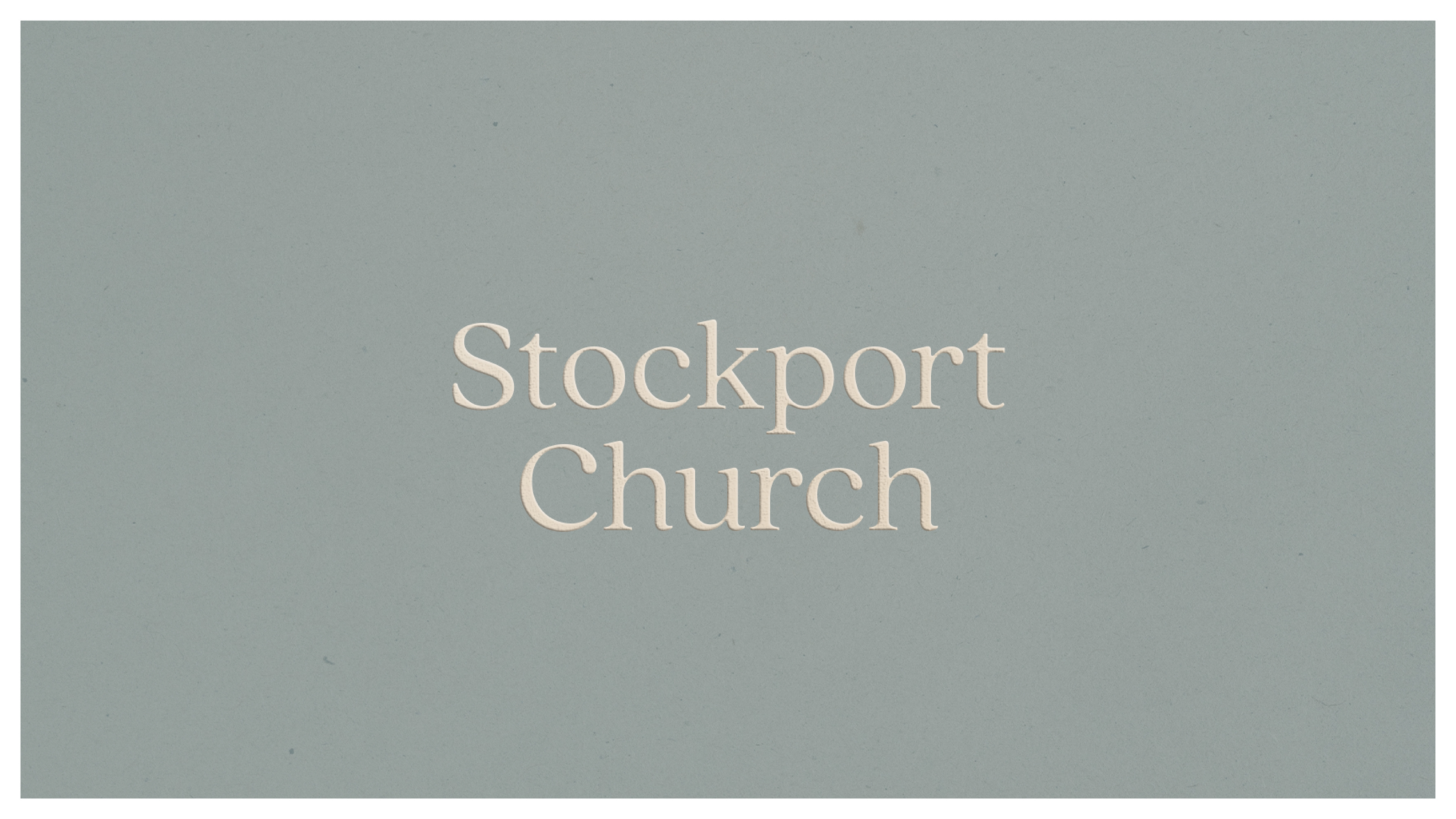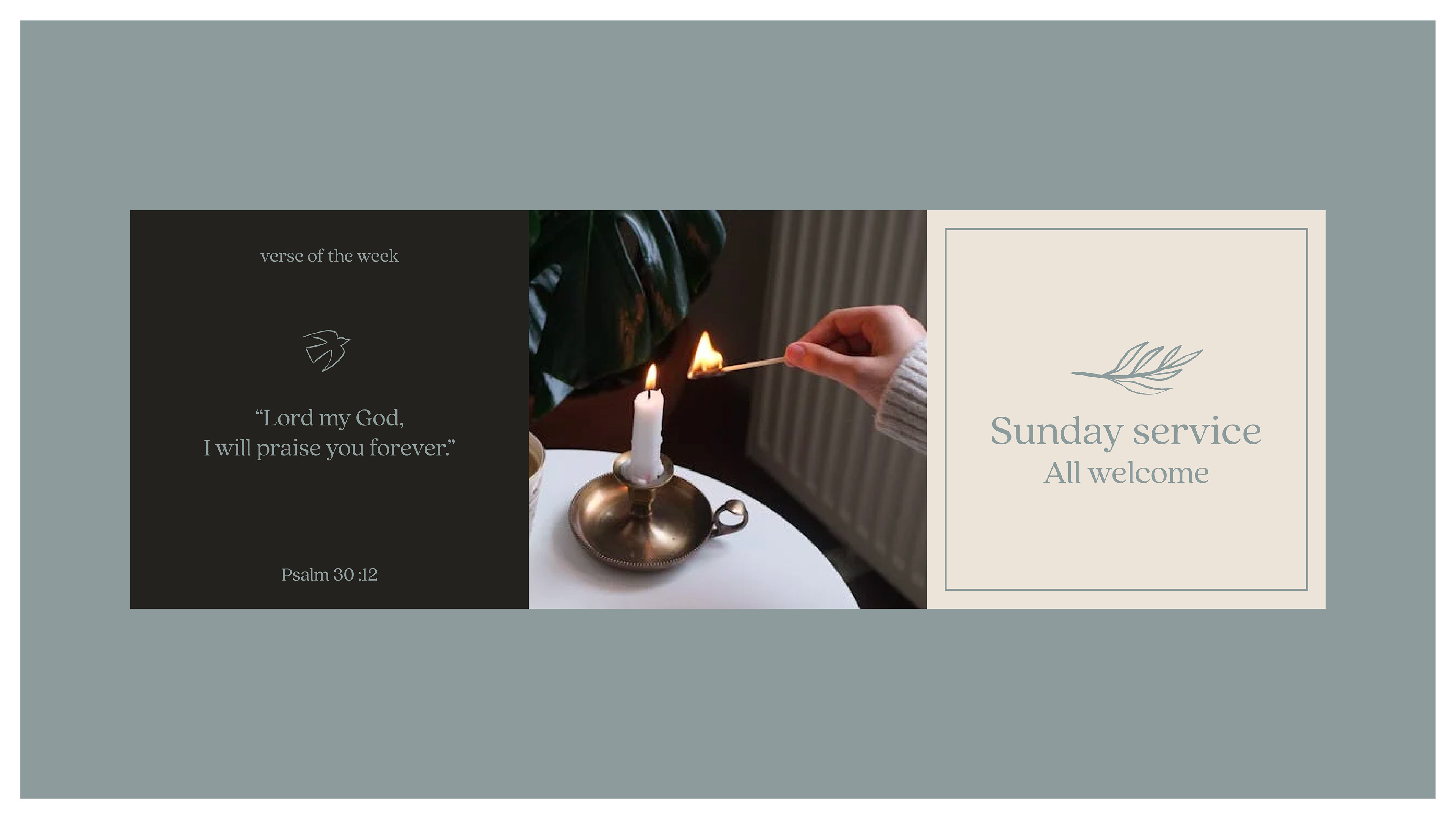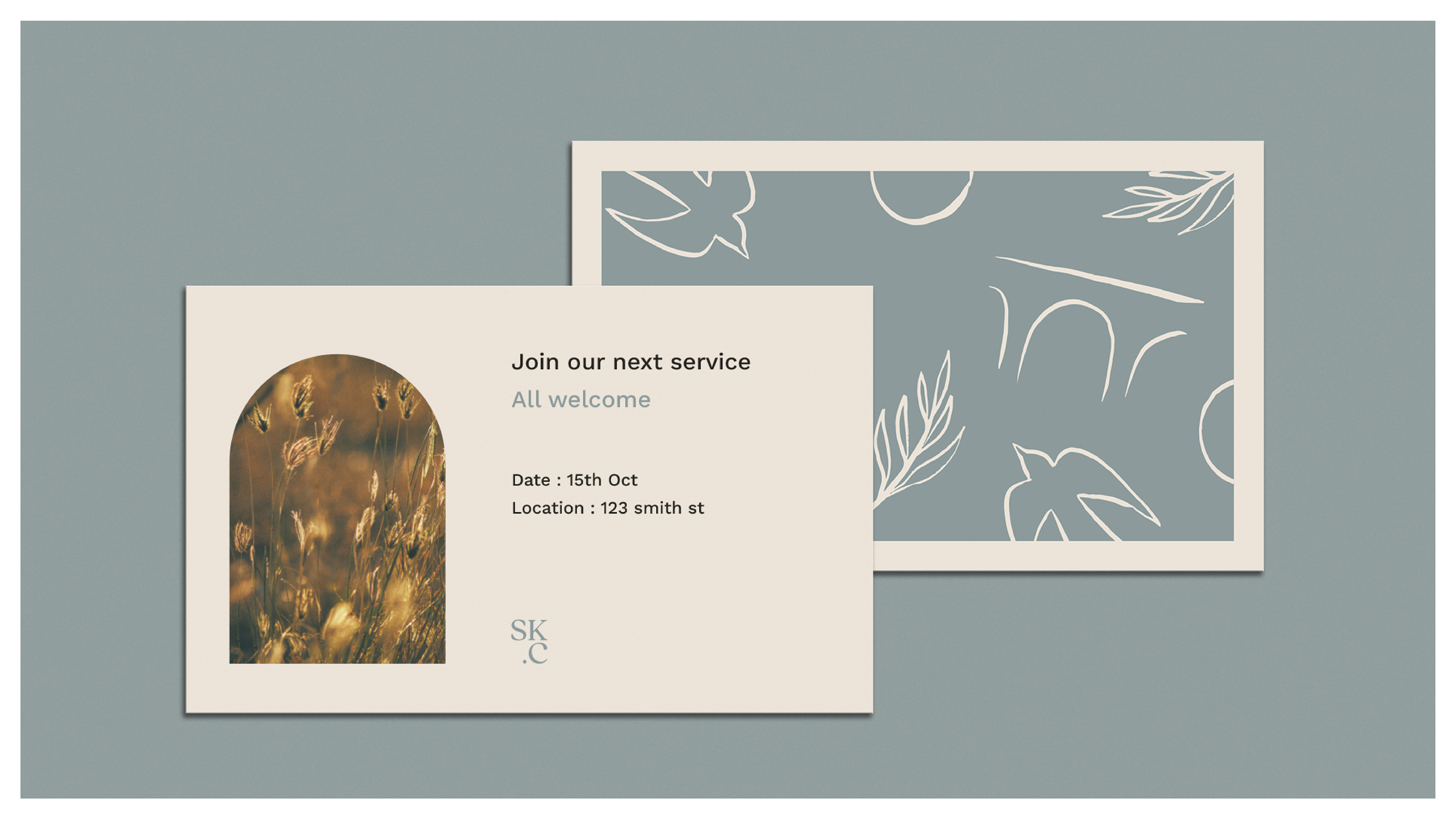

Stockport Church
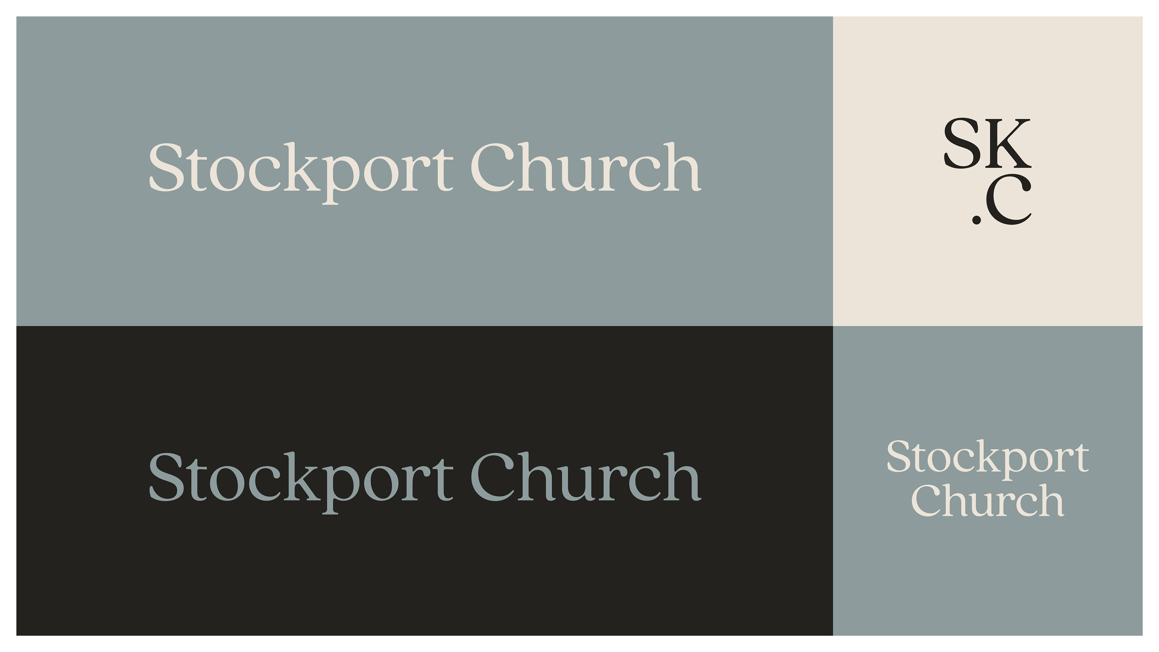
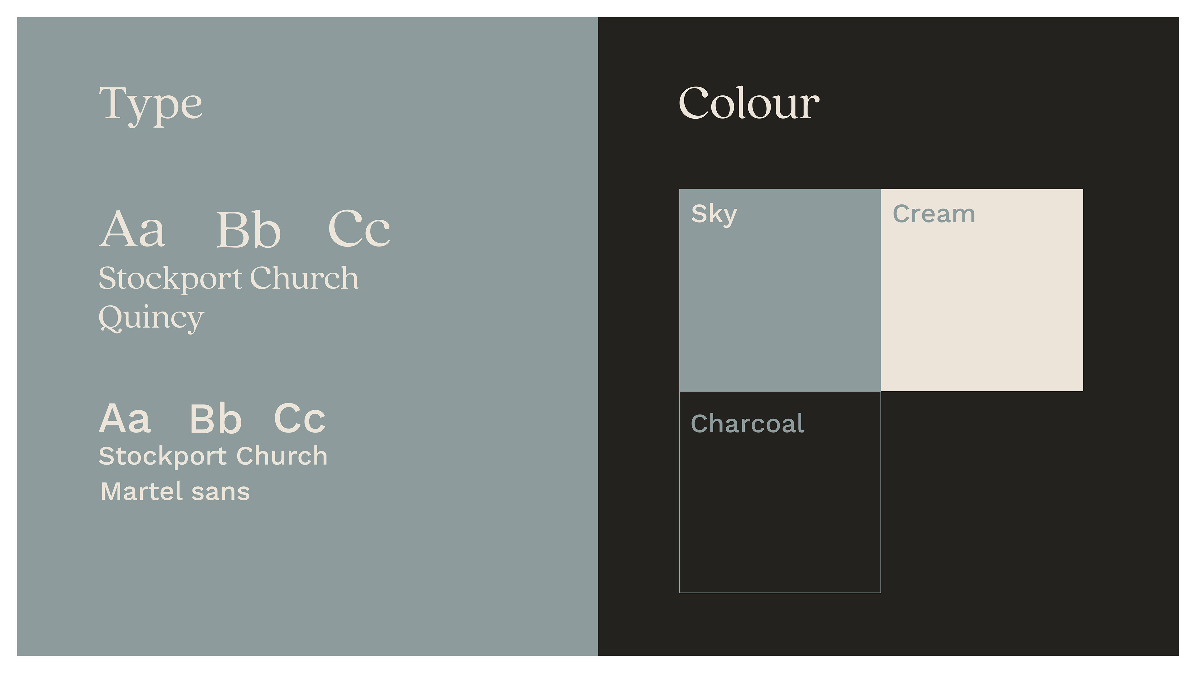
The brand identity for Stockport Church was created to reflect the church’s heart: warm, approachable, and rooted in community. From the beginning, the focus was on designing something that felt genuine and welcoming, steering away from anything overly polished or corporate. Soft, calming tones like sky blue and warm cream were chosen to evoke a sense of peace and tranquility, while a deeper charcoal provides contrast and clarity. This gentle, muted palette helps create an inviting atmosphere, reflecting the church’s desire to be a place of calm and connection.
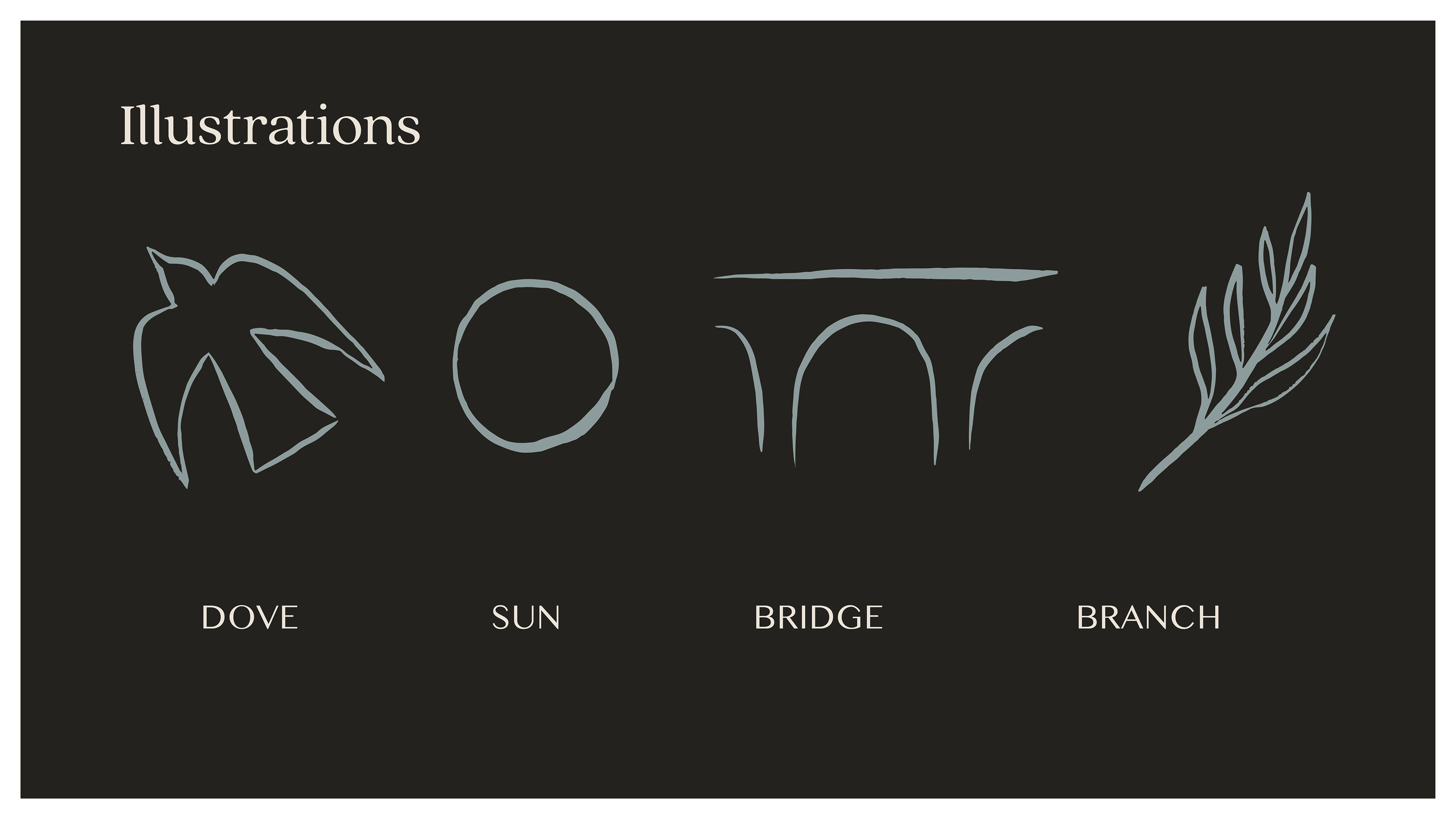
Typography plays a key role in shaping this voice. The combination of Quincy, a serif font full of character, and Martel Sans, a clean and modern typeface, balances tradition and approachability. Supporting the typography are hand-drawn illustrations, which add a personal and human touch to the identity. These illustrations go beyond decoration—they represent both elements of Christian faith and the unique spirit of Stockport itself. Every part of the identity has been considered to ensure it feels authentic and welcoming, laying a strong foundation for the church as it grows and opens its doors to the wider community.