Ella Clayton Branding
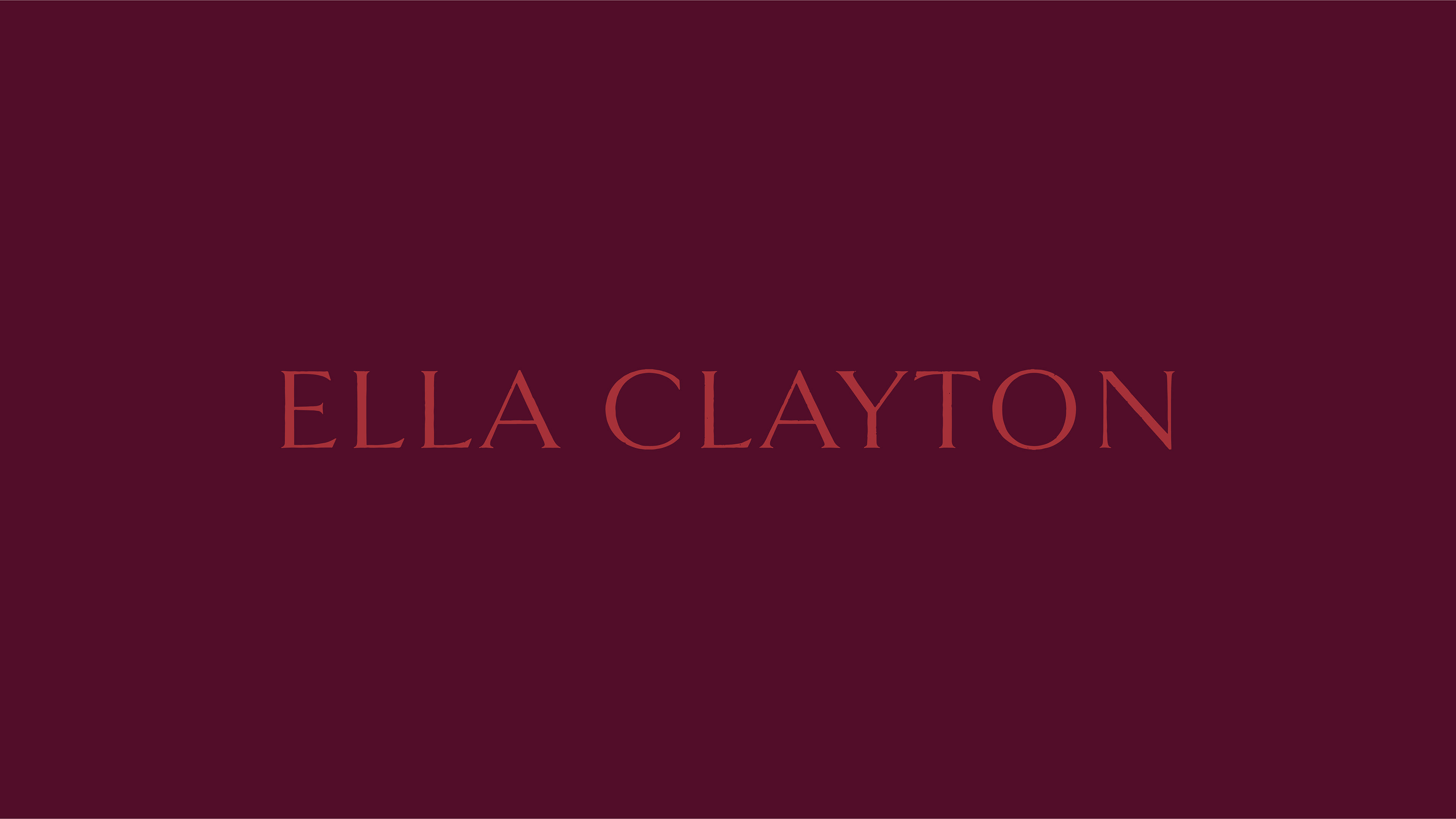
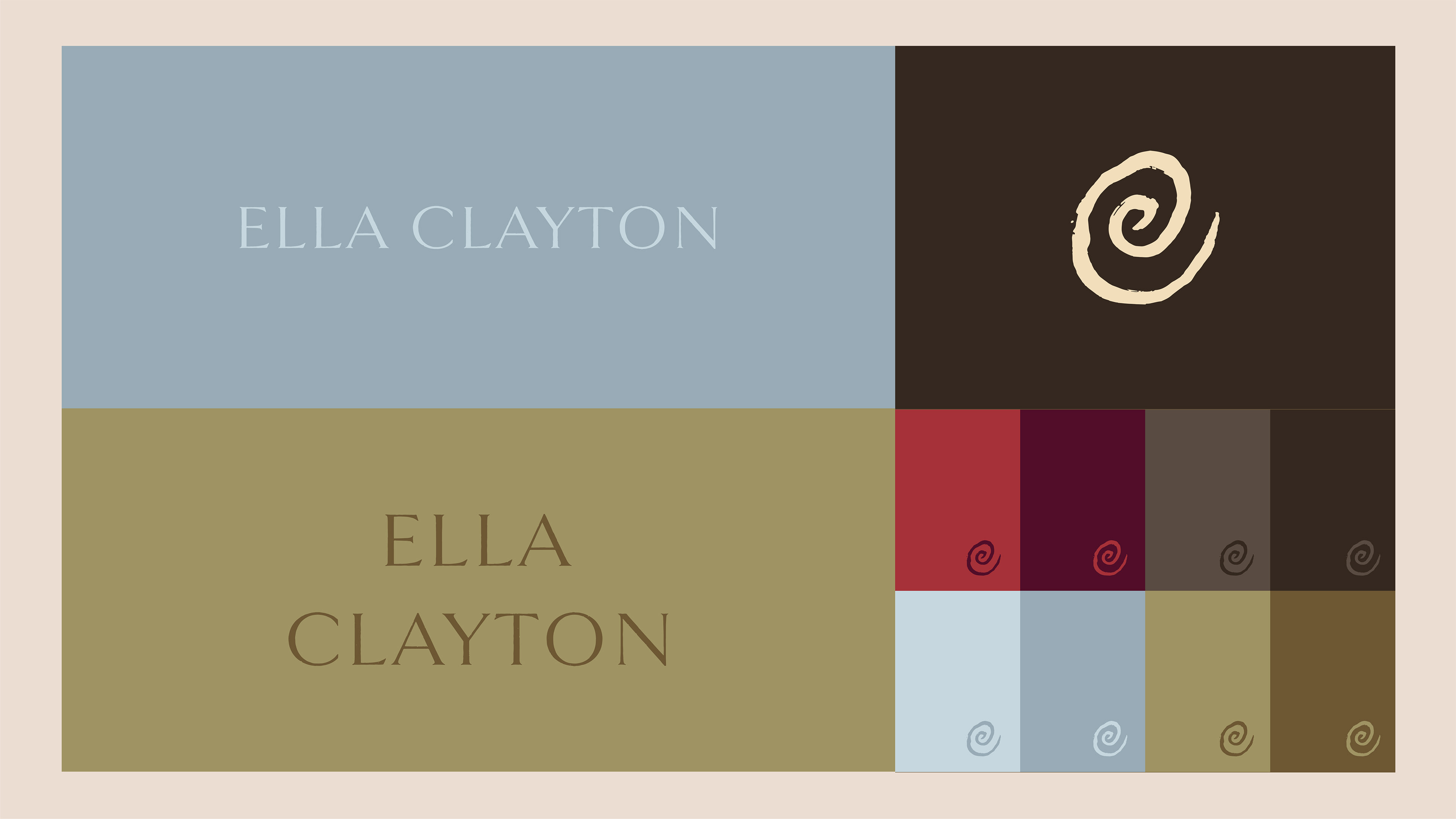
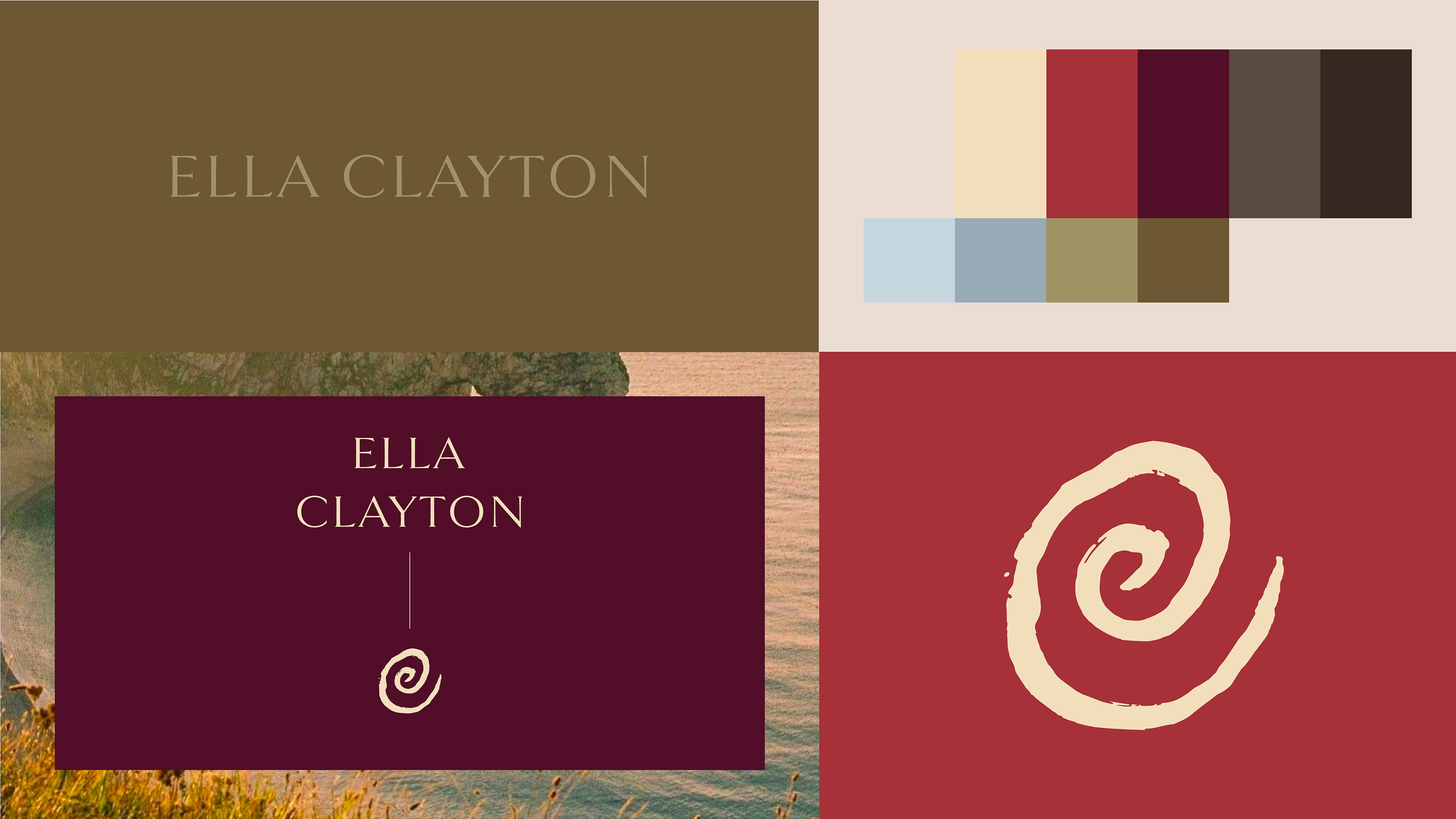
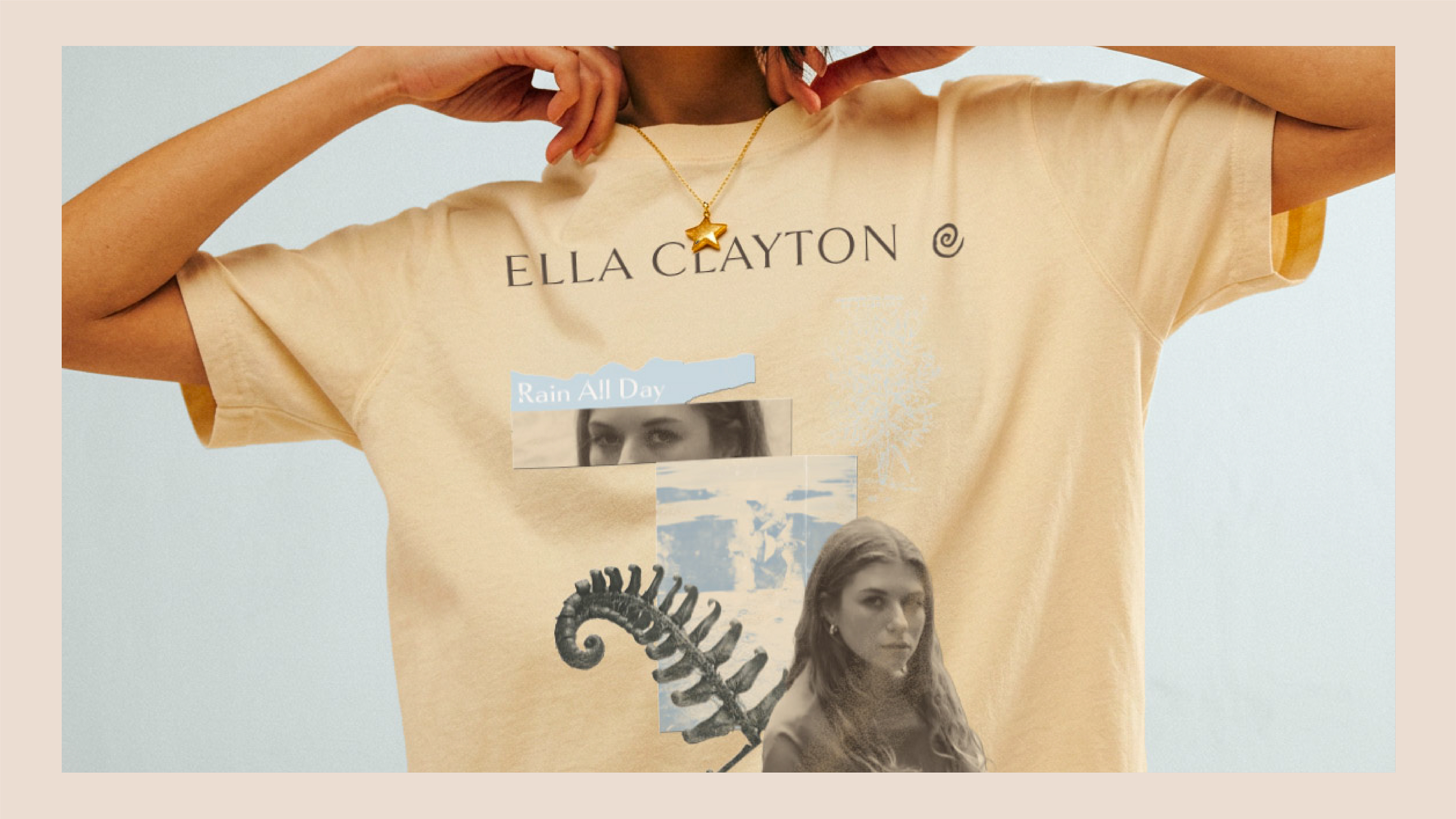
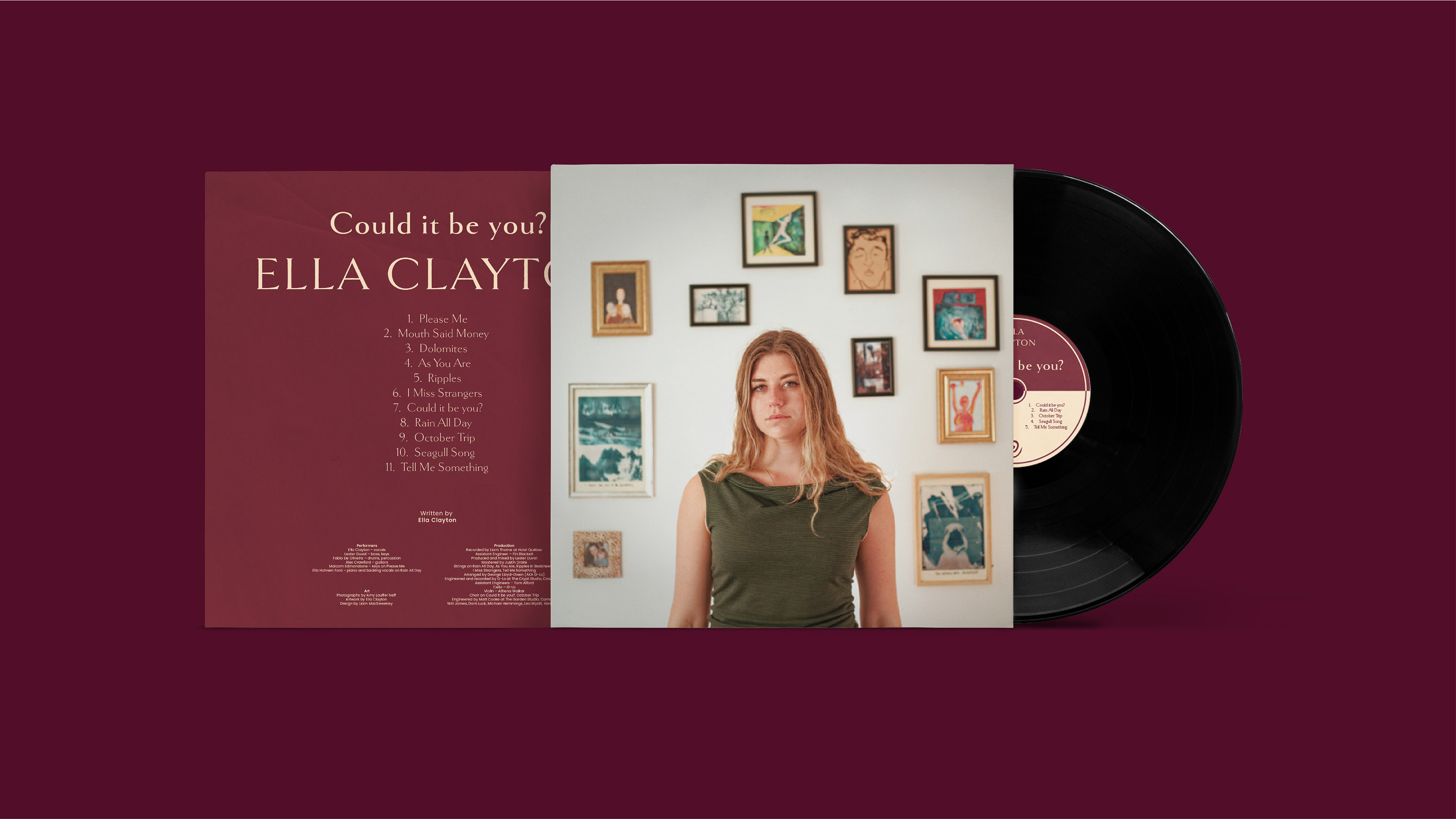
The identity for indie folk singer Ella Clayton centers on organic forms and earthen warmth. The spiral icon, merging her initials 'E' and 'C', evokes natural growth patterns found in shells and ferns, speaking to cycles, journeys, and unfolding narratives central to folk storytelling.
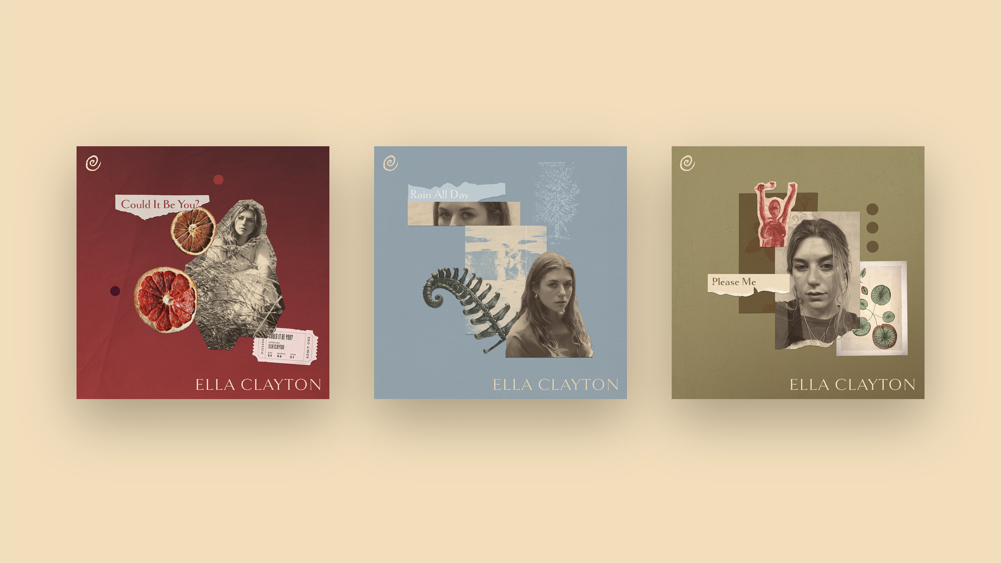
The textured serif wordmark suggests handcrafted authenticity, while the warm palette, from soft blush and ochre to deeper burgundy and plum, creates an intimate, welcoming visual language. Collaged single covers provide layered visual depth that mirrors her songwriting, with each composition offering entry into the emotional landscape of individual tracks.
The system positions Ella as rooted in folk tradition while speaking to contemporary listeners: familiar yet distinct, intimate yet confident.