Brew Crew
The new identity for Brew Crew captures the warmth, craft, and community spirit at the heart of the brand.
The logo lockup features clean, rounded letterforms with subtle punch-outs that echo the shape of coffee beans, balancing friendliness with confidence and impact. To bring the brand’s character to life, a cast of playful illustrated bean characters were introduced — adding charm, storytelling, and an approachable personality across all touchpoints. A bold yet inviting colour palette. Led by warm yellows and rich browns — reflects both the comfort of a fresh brew and Brew Crew’s commitment to supporting coffee growers at origin.
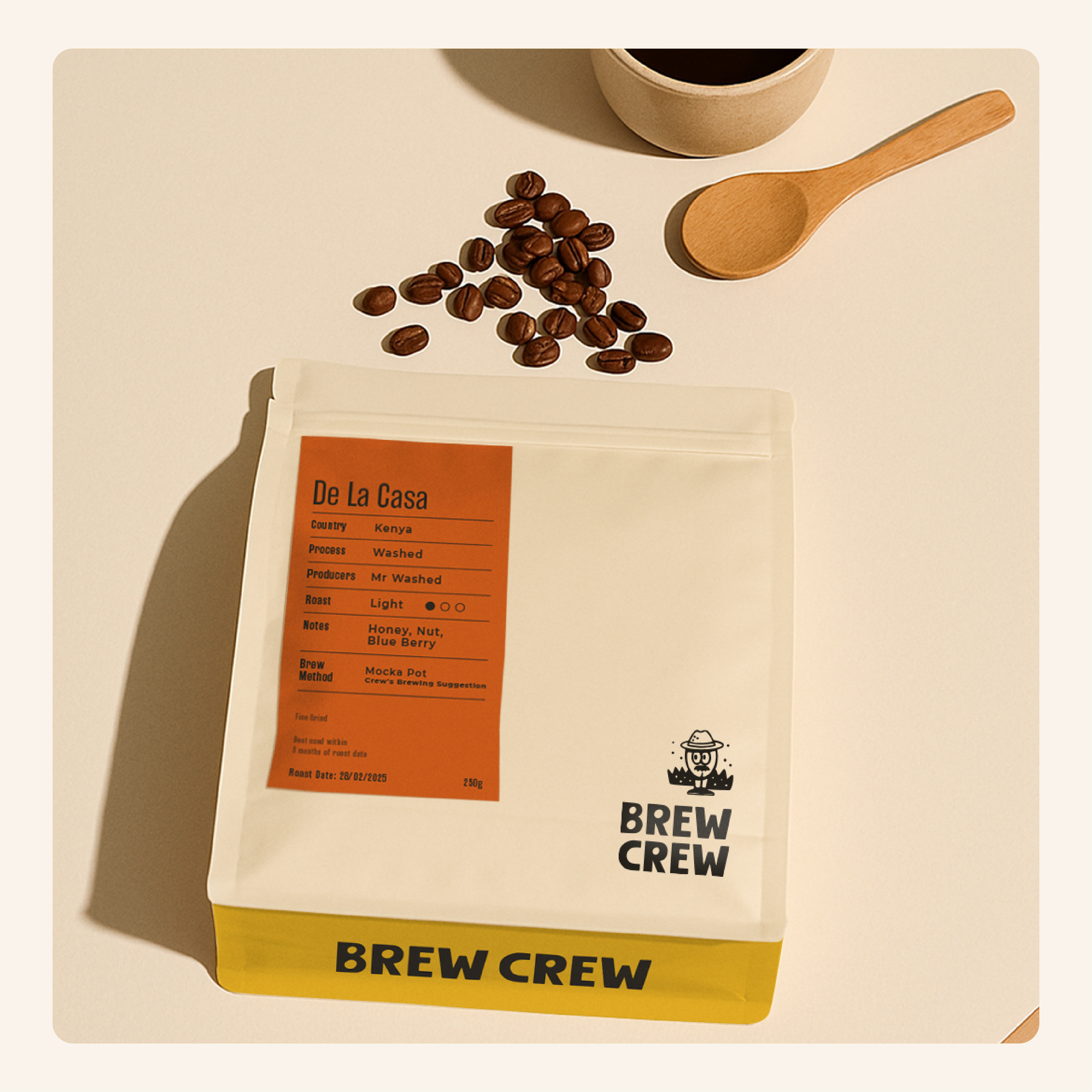
The packaging design is clean, minimal, and easy to identify on shelf, featuring bold yellow printing on the base of each bag and the illustrated characters tucked along the side gussets — creating a delightful reveal when handled. Labels are carefully structured to cater to both coffee enthusiasts and newcomers alike, clearly presenting key details like origin, roast, and flavour profile, while maintaining an earthy, modern aesthetic consistent with the brand’s palette.
Finally, the illustrations and logo system extend seamlessly across merchandise and collateral. From stickers and coffee cups to t-shirts and caps. Helping build a sense of community around the brand.
The result is an identity that feels warm, human, and full of personality, celebrating coffee culture from bean to brew.

