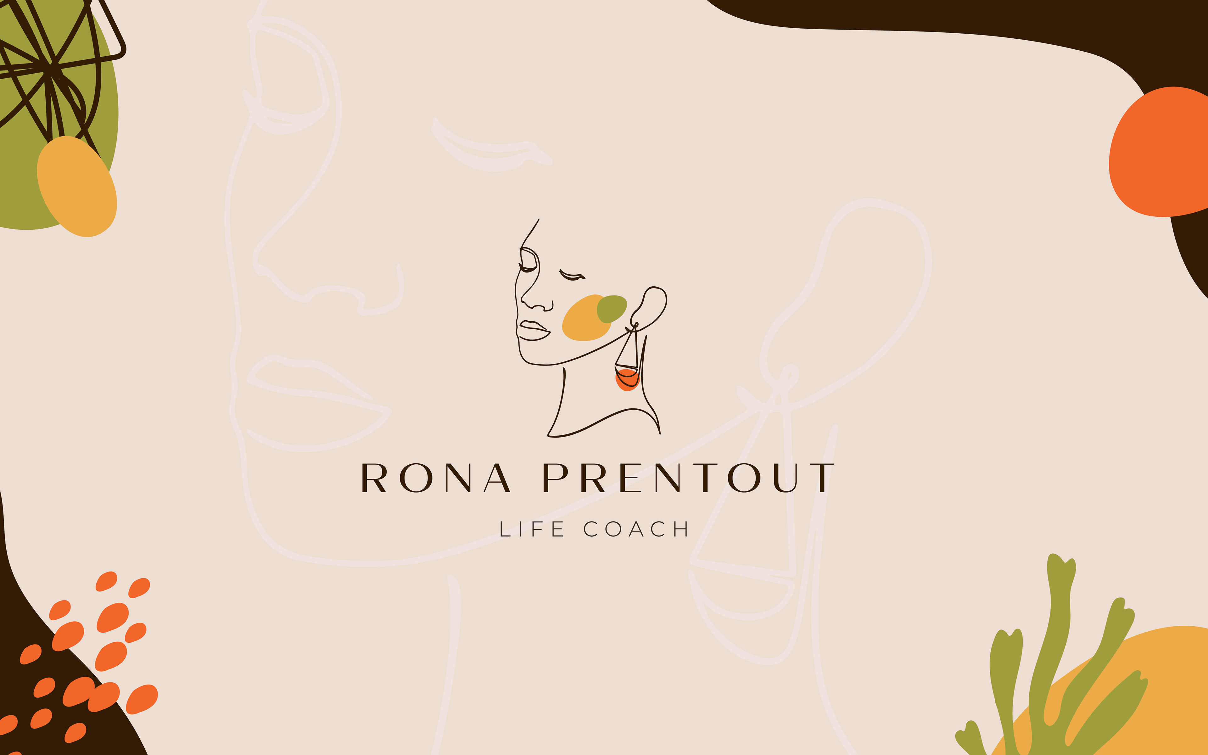
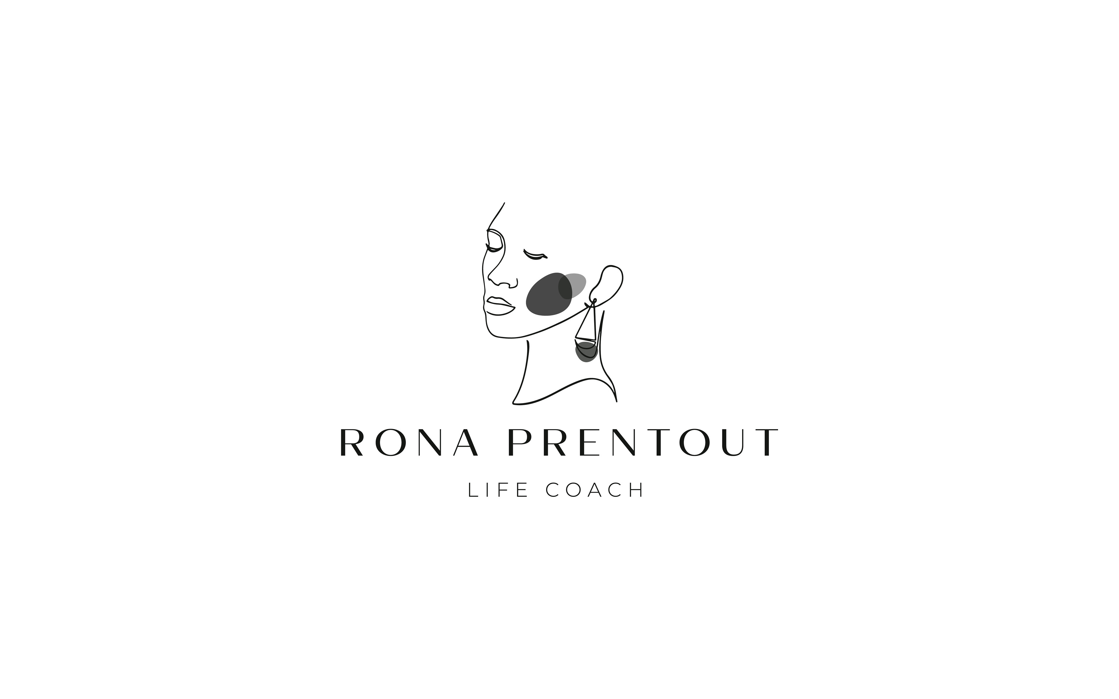
Rona Prentout Logo and Brand Design
Rona's Logo communicates her requested brand values - Courage - Growth - Elevate - Integrity. This is done through the soft organic shapes and an earthy colour palette. As well as a stylised line art portrait of Rona her self radiating a feminine confidence.

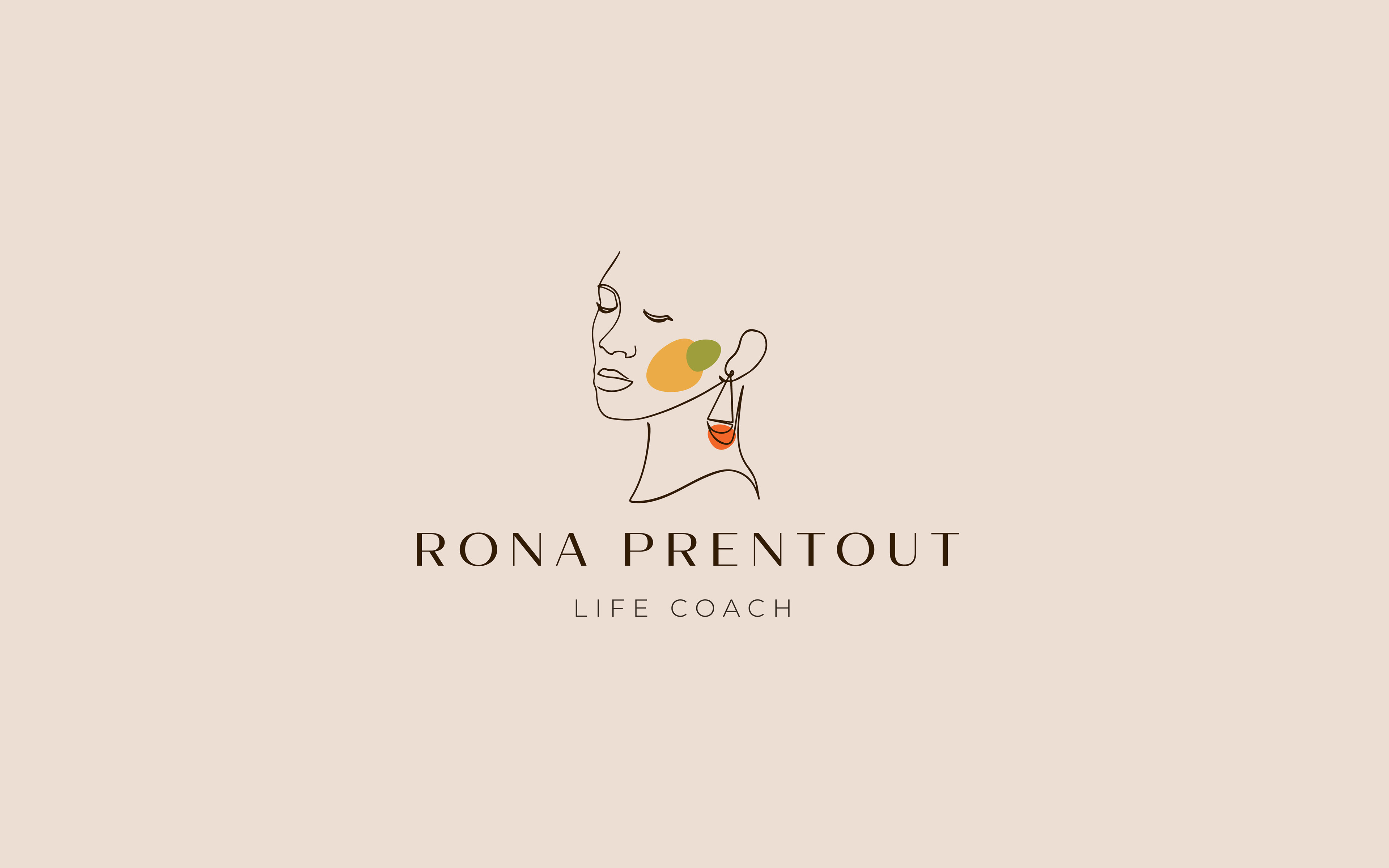

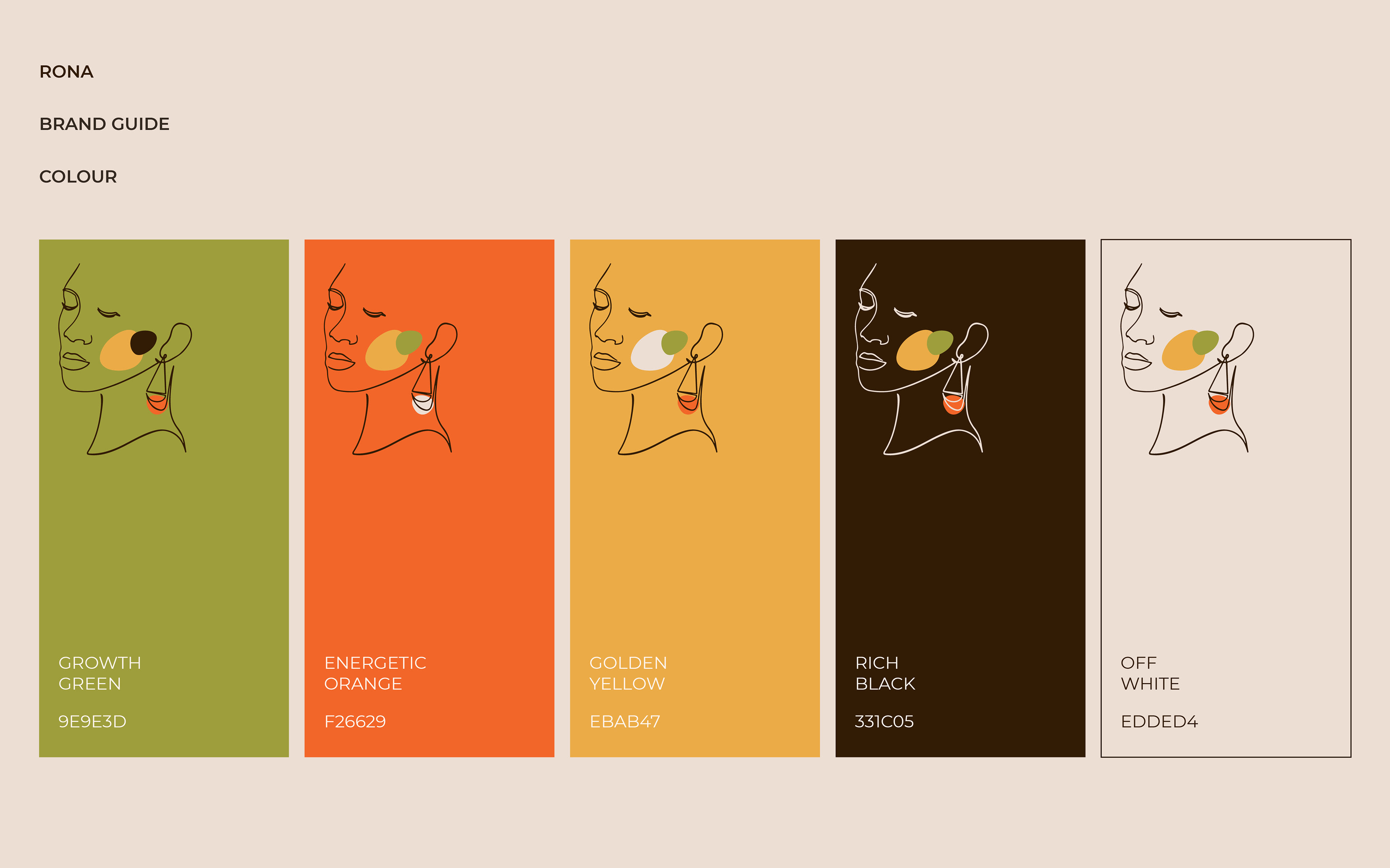
The colour pallet was selected to represent more attributes of Rona and her business. Earthy greens are a symbol of growth, balance, prosperity, restoration. Oranges represent courage, boldness, energy, positivity, playful/fun. And gold wisdom and radiance.
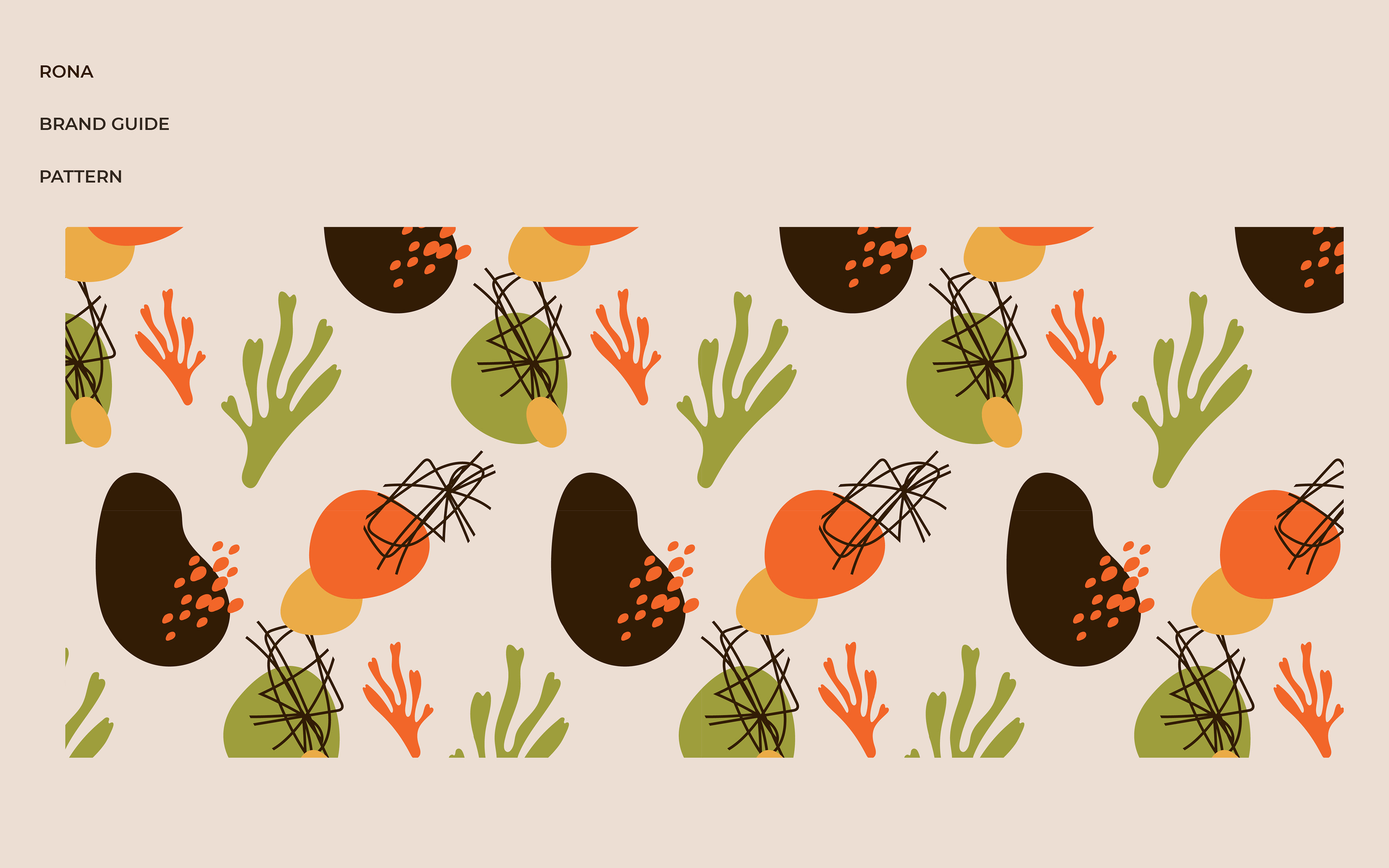
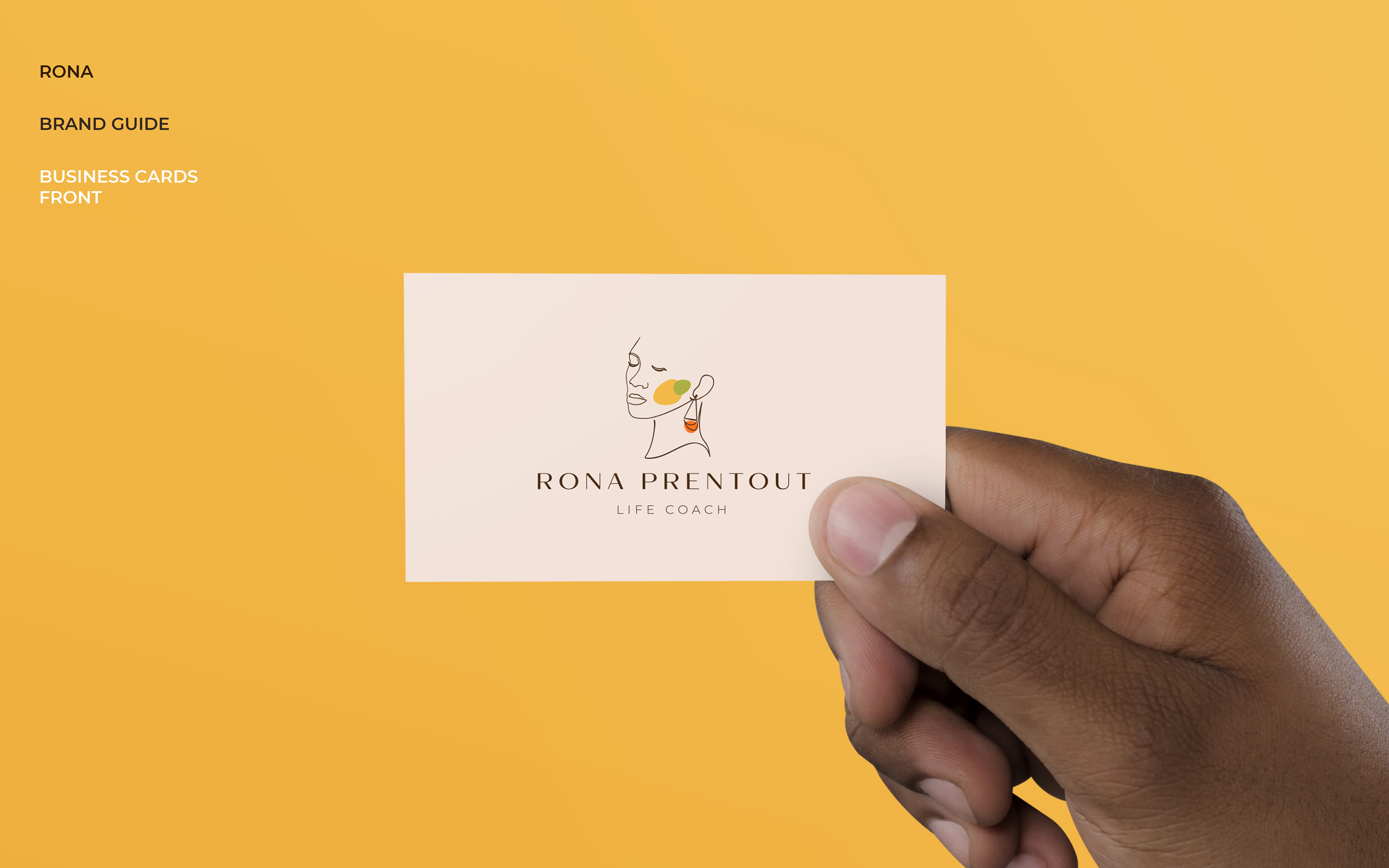
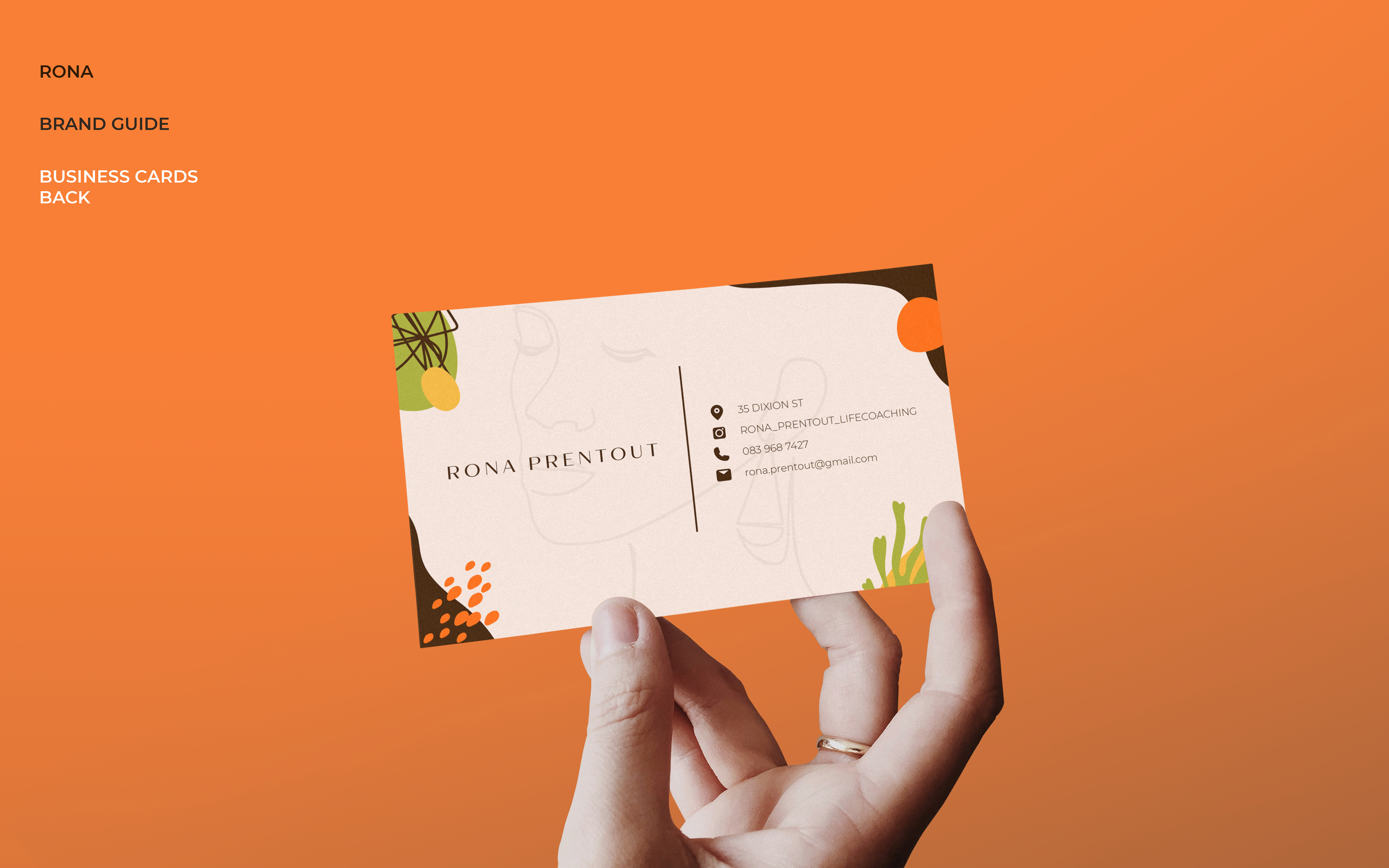
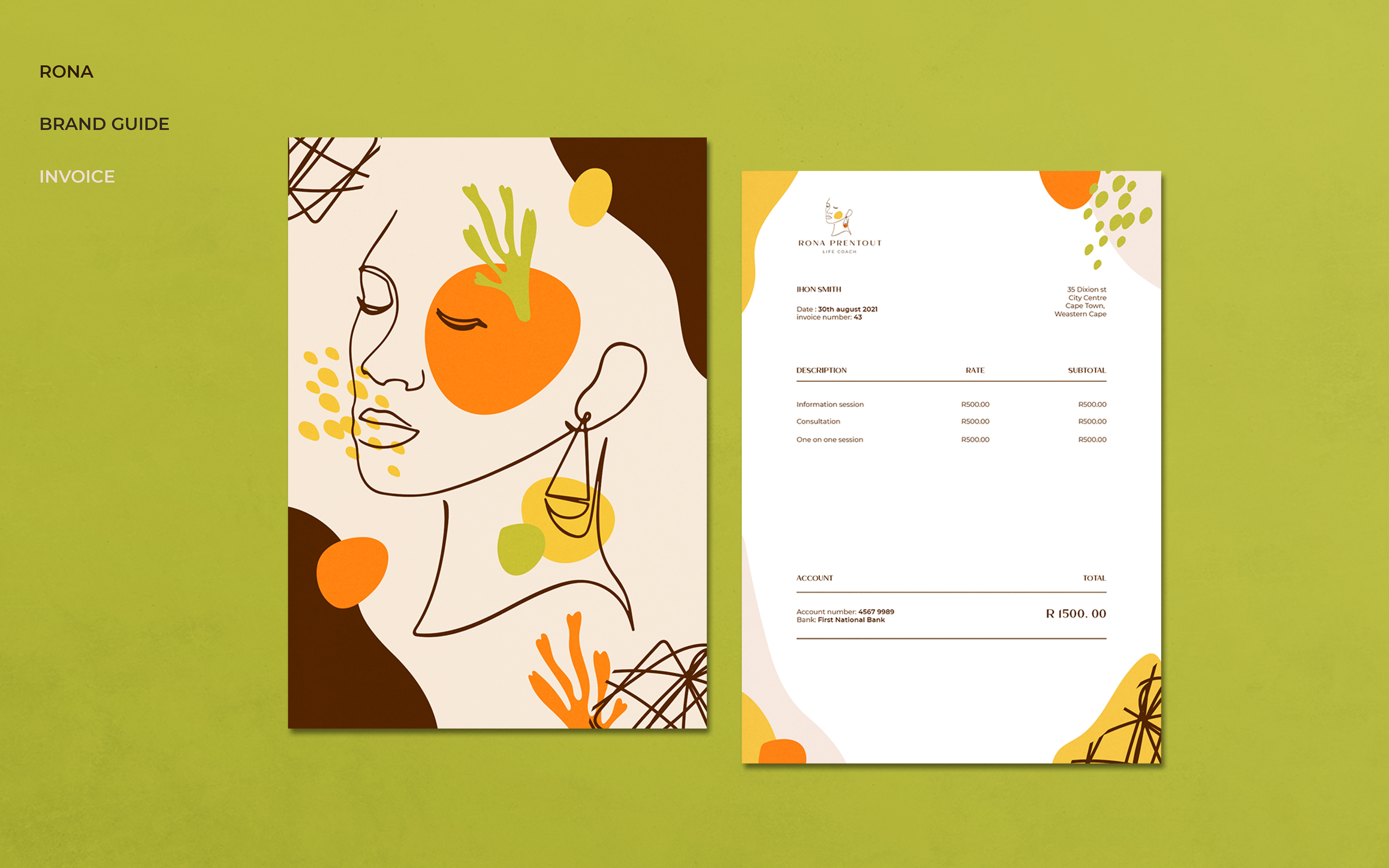
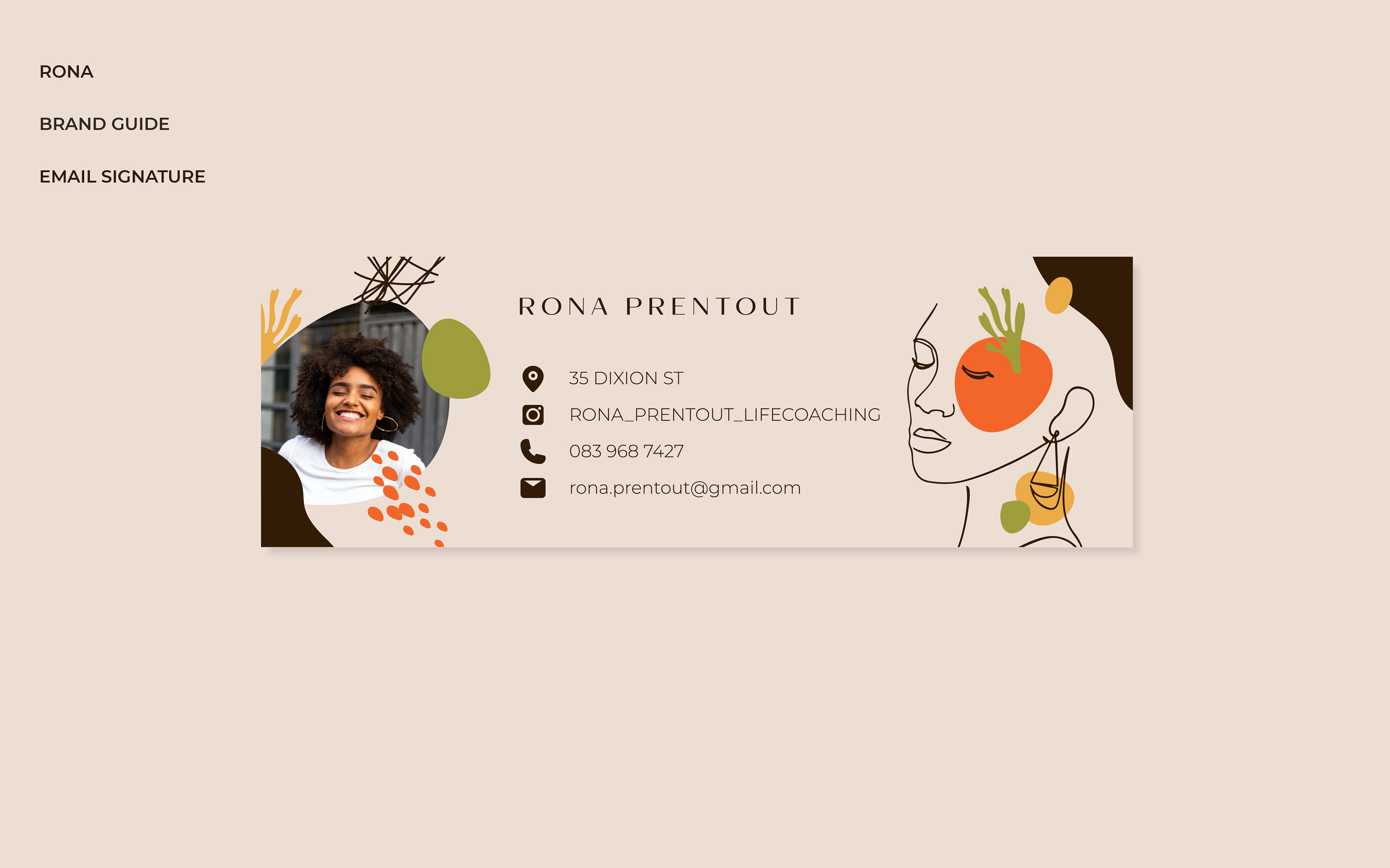
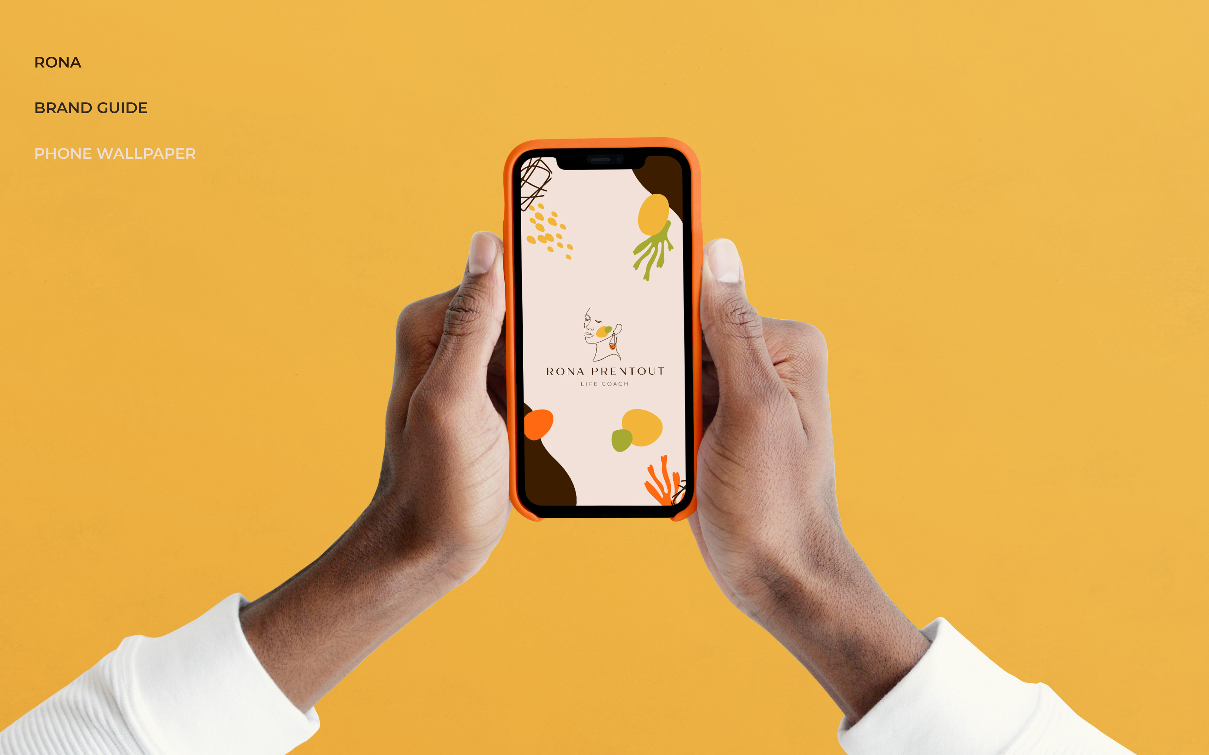

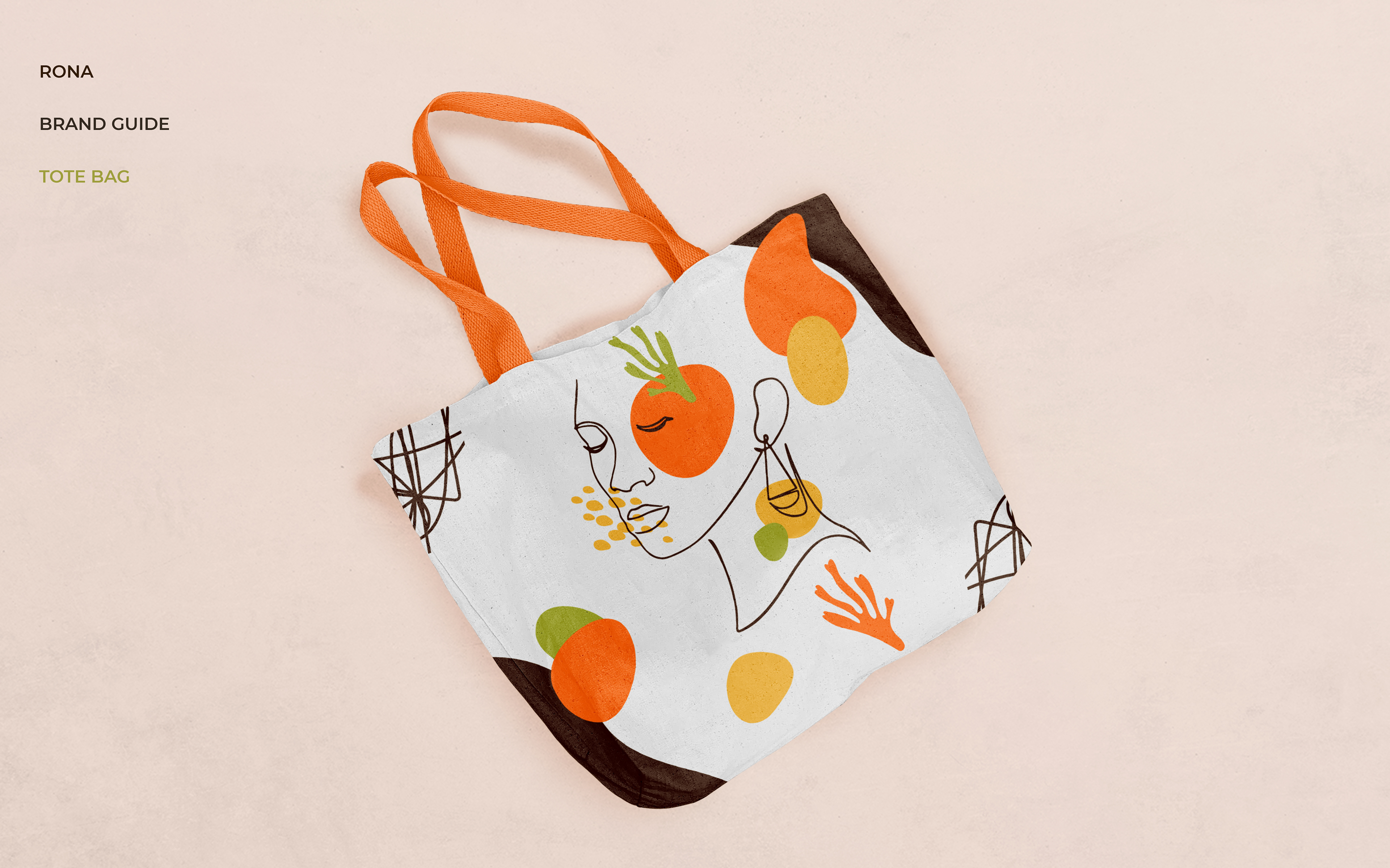

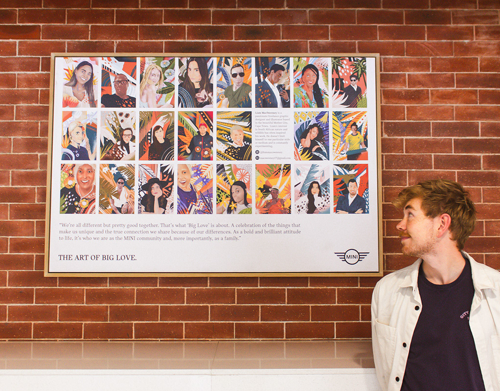
Illustration - Liam Macsweeney
Design - Liam Macsweeney
Thanks for looking
See more here
// Instagram //
See more here
// Instagram //