
The Mimosa brand identity was crafted to capture the vibrant and sophisticated spirit of this new cafe and bar. The core design challenge was to establish a unique and memorable brand presence within the competitive Ballito KZN market.
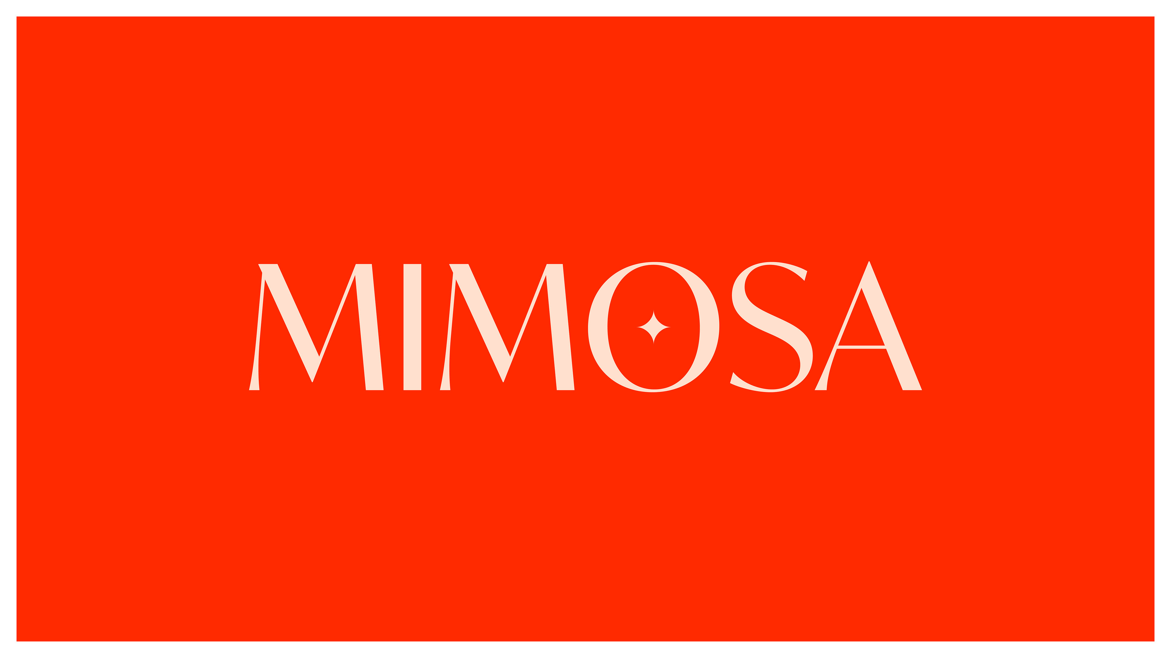
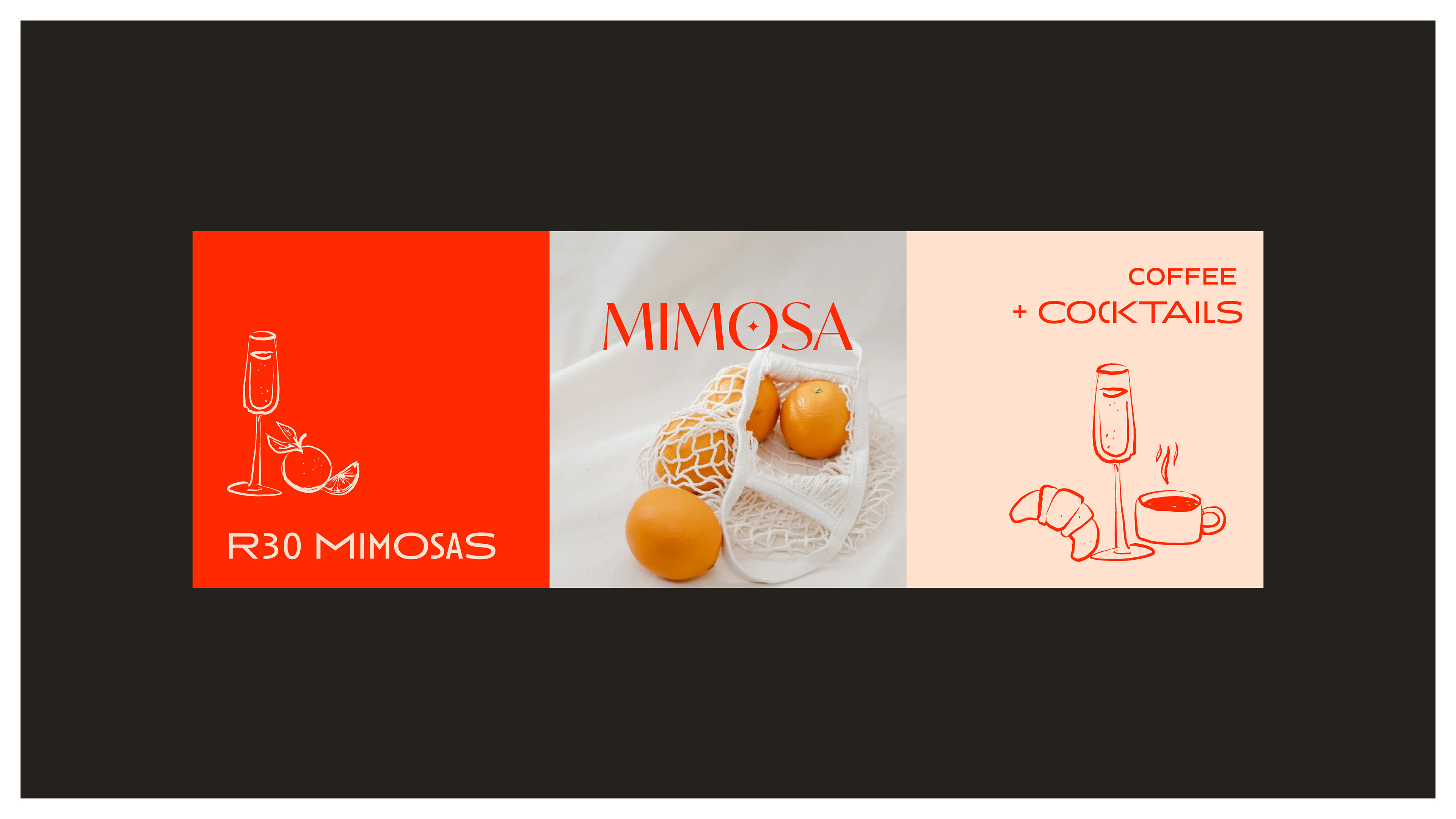
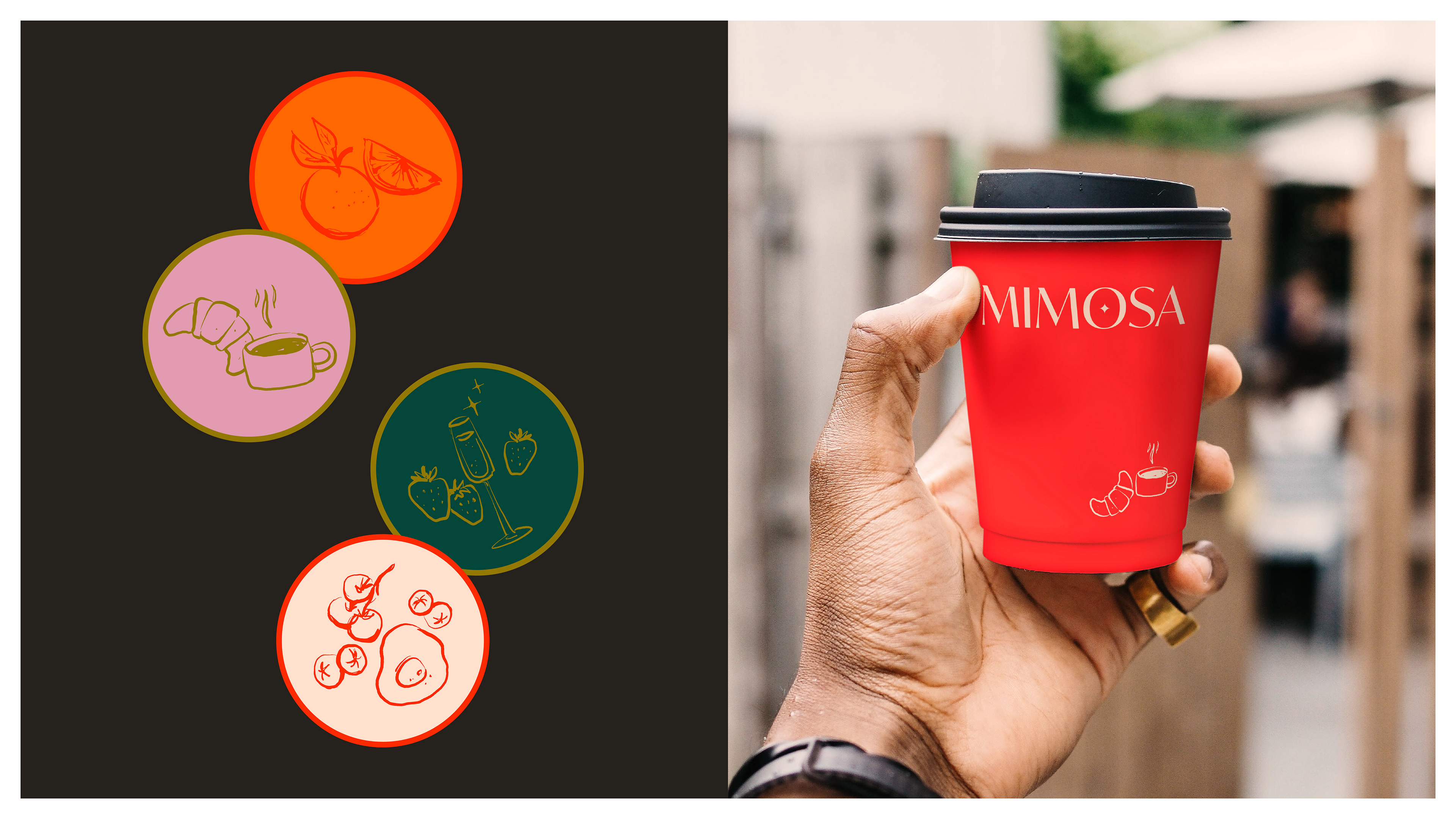
The design solution centers around a custom wordmark logo, carefully developed with a touch of Art Deco influence and a breezy feel. This stylistic choice reflects the cafe's desired personality: elegant yet playful. To establish a visually compelling brand, a vibrant color palette was implemented, drawing inspiration from the mimosa drink itself. This palette features oranges and reds, complemented by bold cream and charcoal, adding both vibrancy and sophistication.
Beyond the logo and colour scheme, hand-drawn illustrations are a key design element, integrated throughout the brand collateral to enhance the brand's overall personality.
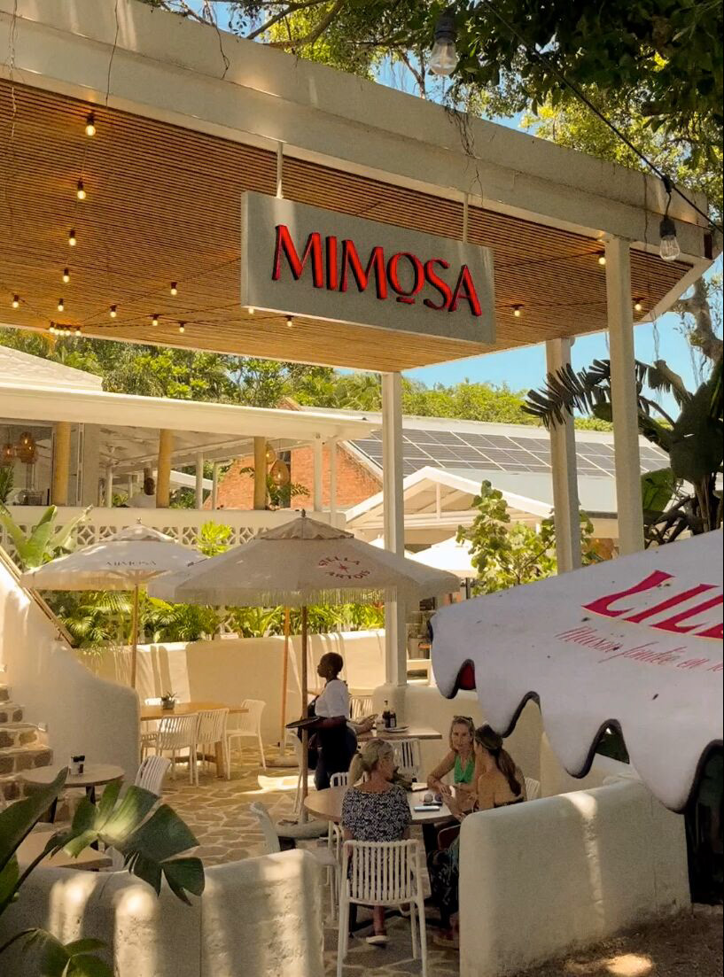
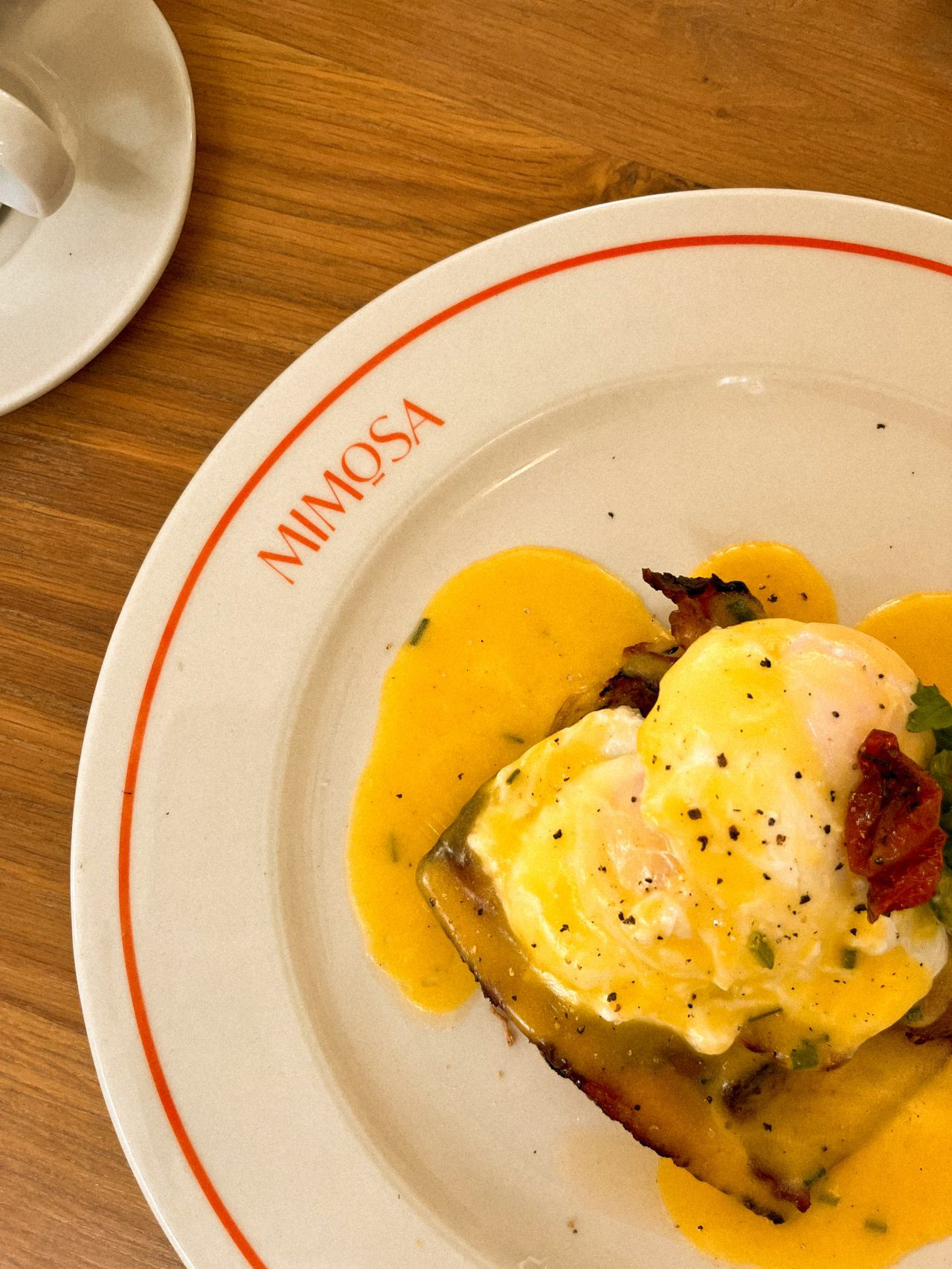
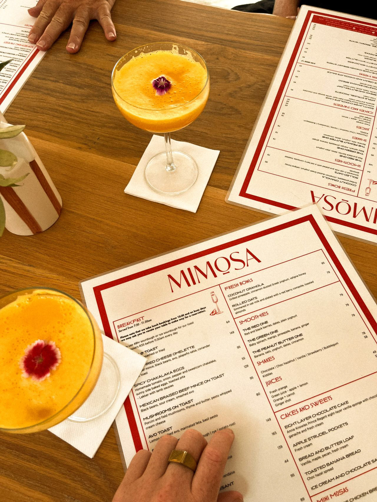
The resulting brand identity provides a captivating representation of the Mimosa experience. Brand guidelines were created to ensure a consistent visual language across all touchpoints, from menus and signage to social media and marketing materials. This comprehensive approach to design equips Mimosa with the essential building blocks for continuous and effective brand development.